Let's consider an experiment in which participants were shown happy pictures (warning: this is a silly experiment, without a proper control condition). Before and after they saw the pictures, they filled in a questionnaire to estimate their mood on a scale from 1 (sad) to 10 (happy). The results of the experiment are shown in the graph below. Each line represents a single participant.
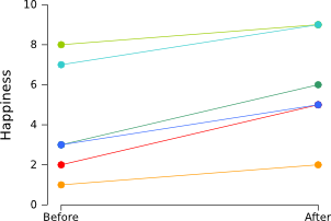
Clearly, people became happier after seeing the happy pictures. This can also be verified easily using a paired samples t-test, which shows that the “before” scores are significantly lower than the “after” scores (p < .005).
However, the graph isn't that nice. We don't want to see individual participants. We'd rather see two average scores ("before" and "after") and a measure of the variability. So what we can do is create a graph with error bars that reflect the 95% confidence interval (i.e., the average of the population is 95% certain to fall within the depicted range):
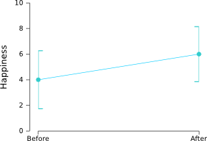
As you can see, the error bars are very large and show a huge overlap! If there is that much variation, how can it be that the difference between “before” and “after” is so highly significant? The reason is that the we are only interested in whether participants have become happier or not. We are not interested at all in how happy the participants were to begin with. All participants became happier and therefore our t-test showed a significant difference between “before” and “after”. But there is a lot of variation in how happy the participants were to begin with. This doesn't affect our statistics, but it does blow up the error bars.
Phrased differently, the trouble arises because we use “between subject” error bars in a “within subject” design. Phrased differently yet again, we are interested in comparing each participant to itself, but we have plotted error bars that reflect the difference between the participants.
How to remove “between-subject variability”
Luckily, there is a really straightforward solution, described by Cousineau (2005). This solution entails “removing the between-subject variability”, or, simply put, making sure that all participants have the same average. As you can see in the table below, the average happiness (of “before” and “after”) of the six participants differs quite a bit. This is what messes up our error bars.
Subject     Before  After   Subject average
Richard     2       5       3.5
Sebastiaan  1       2       1.5
Lotje       8       9       8.5
Jan         3       6       4.5
Daniel      7       9       8
Lisette     3       5       4

Grand average               5
In order to remove the between-subject variability, we simply subtract the subject average from each observation, and add the grand average (i.e., the average of all the cells):
new value = old value – subject average + grand average
So Richard's “before” score becomes 2 – 3.5 + 5 = 3.5. Easy right? By clever copy-pasting in your favorite spreadsheet you can perform this calculation quickly for all the cells. After performing this “normalization” procedure, we get the following table:
Subject     Before  After   Subject average
Richard     3.5     6.5     5
Sebastiaan  4.5     5.5     5
Lotje       4.5     5.5     5
Jan         3.5     6.5     5
Daniel      4       6       5
Lisette     4       6       5

Grand average               5
How to create within-subject error bars
If you use a software package, such as SPSS or R, that creates error bars for you, you can now simply input your normalized data to get nice within-subject error bars. Please note that you should use the normalized data only for visualization purposes, not to do any statistics!
However, if you want some more control you can delve a little deeper and calculate the size of the within-subject error bars yourself. The size of the 95% within-subject error bars is simply determined by:
95% CI error bar size = 1.96 * standard error
standard error = standard deviation / square root of the number of participants
Let's apply this to our data:
Subject     Before  After   Subject average
Richard     3.5     6.5     5
Sebastiaan  4.5     5.5     5
Lotje       4.5     5.5     5
Jan         3.5     6.5     5
Daniel      4       6       5
Lisette     4       6       5

Std.dev.    0.45    0.45
SE          0.18    0.18    (= Std.dev. / sqrt(6))
Error bars  0.36    0.36    (= 1.96 * SE; size of 95% CI error bars)

Grand average               5
The resulting graph looks like this:
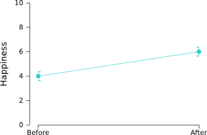
Now the error bars are small, as they should be given the highly significant difference between "before" and "after". Nice!
A nice tool for creating graphs
I often use Gnumeric to create graphs. The nice thing about
Gnumeric is that it gives you lots of control over your graphs. And it also
allows you to easily add error bars. You can get Gnumeric for free here: http://projects.gnome.org/gnumeric/downloads.shtml
References
Cousineau, D. (2005). Confidence intervals in within-subject designs: A simpler solution to Loftus and Masson’s method. Tutorial in Quantitative Methods for Psychology, 1(1), 4–45. [PDF: Open Access]