In the video below, you see three rings of coloured dots. In each ring there is one gap (a missing dot), and these gaps rotate like the arms on a clock. So far nothing remarkable. But see what happens if you fixate on the central cross for 15 seconds. Illusory dots of various colours will start to appear where the gaps are!
This illusion is a demonstration of the colour after effect. After effects are very basic phenomena, and most of the video is essentially decoration, not necessary for the illusion occur. In fact, you will even get a colour after effect if you present a single coloured dot, look at it for a while, and then remove it. If the dot is green, like the inner circle in the video, you will observe an after effect in the form of an illusory pinkish dot.
So what's going on here?
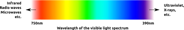
Let's start with the fundamentals. Light is electromagnetic radiation, just like radio signals, WiFi, microwave radiation, etc. Different forms of electromagnetic radiation are characterized by different wavelengths, and visible light corresponds to a tiny range from roughly 390 to 750 nanometre (one billionth of a meter). Within the spectrum of visible light, different wavelengths correspond to different colours: Short wavelengths are blue(ish), long wavelengths are red(dish).
Like most people, I learned about the relationship between colour and wavelength during physics class in high school (see [1]). And I distinctly remember that I found this very puzzling. After all, in art class we were taught that colours form a circle. This seemed to conflict with the idea that colours correspond to a range of electromagnetic radiation, with a beginning and an end.

Intuitively, the artist's colour circle makes a lot of sense: It's perfectly smooth, and I dare you to come up with a colour that's not in there. Yet, from a physics point of view, it makes no sense at all to organize colours into a circle: Colours should be organized into a straight line, and after violet should come, well... nothing. Certainly not red!
The fact that, for the purpose of human perception, colours appear to make up a circle, is a result of the way that light is captured by our eyes. The retina, which is the light sensitive layer at the back of our eyes, contains four types of light sensitive cells, or photoreceptors. One class of photoreceptors, the rods, isn't very important for colour vision. So that leaves three types of photoreceptors, collectively called cones. Each of these three cone-types is sensitive to a slightly different range of wavelengths.
In other words, colour perception relies on three types of receptors, each of which is (most) sensitive to a specific colour. One for blue, one for green, and one for red. (This is an approximation. The real colours are slightly different, but it's easiest to just think of them as red, green, and blue.)
![Source: [url=http://andrewharvey4.wordpress.com/2009/08/22/comp3421-lec-1-colour/]Andrew Harvey's blog[/url]](http://www.cogsci.nl/images/stories/blog/figures/hsl_cone.png) So you can think of colour vision as being defined by three coordinates: the amount of Red, Green, and Blue. You can also express colours differently, using an alternative set of three coordinates: Hue (the 'taste' of the colour), Saturation (how pure, or non-gray, a colour is), and Lightness (how bright a colour is). This is perhaps a bit hard to grasp, but RGB and HSL are equivalent ways of expressing a colour. If you know a colour's RGB value, you can calculate its HSL value, and vice versa.
So you can think of colour vision as being defined by three coordinates: the amount of Red, Green, and Blue. You can also express colours differently, using an alternative set of three coordinates: Hue (the 'taste' of the colour), Saturation (how pure, or non-gray, a colour is), and Lightness (how bright a colour is). This is perhaps a bit hard to grasp, but RGB and HSL are equivalent ways of expressing a colour. If you know a colour's RGB value, you can calculate its HSL value, and vice versa.
The colour circle essentially reflects the hue coordinate from the HLS notation. So the colour circle is indeed perfectly sensible, albeit incomplete. In order to fully represent a colour, you need a three-dimensional colour cone, which also represents saturation and lightness.
But let's focus once more on the colour after effect. We now know a bit about colour perception, but not quite enough to understand the illusion. How can we explain the specific after effect that a colour produces? Why does green give a red(dish)/pink(ish) after effect, rather than a blue one, or some other colour?
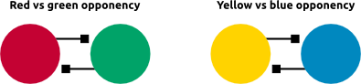
In very general terms, the explanation is that we do not perceive things as they really are, but as they are relative to other things. More specifically, in colour perception this means that we do not perceive, say, the amount of red, but the amount of red relative to the amount of green. This principle is called colour opponency, and can be traced back to specific types of neurons. Neurons that respond to green are inhibited by red, and vice versa.
In addition to the red vs green opponency, there is also a yellow vs blue opponency. You may notice that the yellow vs blue opponency doesn't appear to map directly onto the three types of photoreceptors, because there is no yellow-specific receptor. But you can also think of it as a red+green vs blue opponency. So the colour opponency system builds very neatly upon the trichromatic (three colour) system that I described above.
We now have all the tools that we need to explain the colour after effect! Let's say that you are exposed for some time to a red dot. Your eyes will adapt to the colour red, effectively perceiving less red than there actually is, just like you will adapt to increased levels of light. If the red dot subsequently disappears, your eyes will not immediately recover, because adaptation is slow, and for some time you will still perceive less red than there is. Following the principle of colour opponency, perceiving less red is the same as perceiving more green. Together, this explains why perception of a red dot gives an after effect in the form of an illusory green(ish) dot.
Just try it: Determine the colour of the after effect for each of the three rows in the video above, and see how it compares to the colours of the rings. It will take a bit of figuring out, particularly for the mixed colours, but you will see that the after effect is always compatible with the colour opponency principle!
Notes
1. In school, I also learned that there are three primary colours: red, yellow, and, blue. It appears to a widespread belief, at least among artists, that there is really something special about these three colours. But, as far as I know, there is no reason whatsoever to single out red, yellow, and blue. From a physics perspective, all colours are equally primary, because each colour is associated with a single wavelength. From a physiological perspective, you could argue that the three primary colours are those that correspond to the peak sensitivity of the three cone-types. Given this definition, the three primary colours would be red(dish), green(ish), and blue(ish). Perhaps the reason that yellow is such a popular choice for a primary colour is that the sun is typically depicted as yellow(ish)? I honestly don't know.